
Cloud Data Viz and Analytics Health Check
Uncover the fitness of your Cloud Data Viz & Analytics
Get my free scoreAstrato Monthly Roadmap Update: March
Welcome to the March edition of the Astrato monthly roadmap update!
Our monthly roundup showcases the exciting new and improved capabilities of our solution – so you can continue to build world class dashboards and Data Apps that drive better decision-making and make an impact. Here, you’ll find recent releases, info about our most exciting new features, and all the latest news straight from our team of product experts 🚀
Here’s what we’re talking about this month…
…Media Gallery, Histogram, Slider object, new style and icon options for Button Control, and Query Profile Insights!
Media Gallery for secure and convenient media upload and sharing
In need of some imagery to help your workbooks stand out? This month we are proud to say that Astrato now has a Media Gallery! A secure and managed platform that enables users to add, share and publish media assets. Once uploaded, these assets can be re-used later in objects such as the Image object.
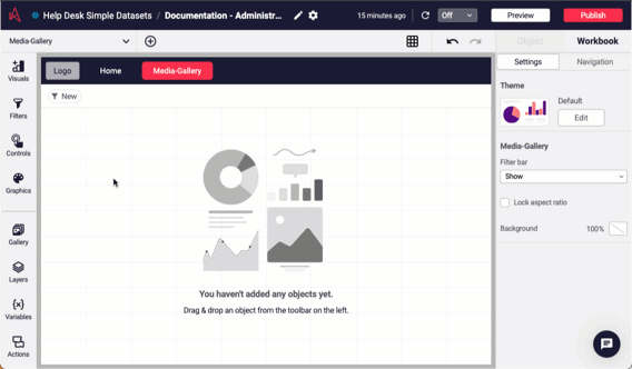
And as always, this capability comes with the peace of mind that Astrato protects your assets and images. Our security and access control ensures that they are safe from both external parties and any internal users you choose.
For administrators, we also introduce the ability to centrally upload media assets to your tenant that become available for all authors. This means you can securely manage company-wide media such as logos and branding material in one central location.
Read more, here.
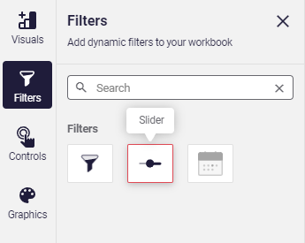
Slider object for precise and instantaneous range selection
Looking for a particular value or set of values in your dashboard? With the recent release of our new range Slider object you can now filter values in your dashboard in a few clicks (or should we say, slides). This means you now have an even faster way to select numerical and sequential values such as sales value, or product cost.
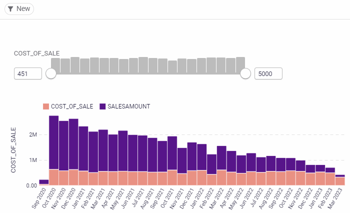
Just drag the slider’s handles to select a range of values for a numeric or date field and see the corresponding data filtered in your dashboard – instantly.
Key features of this new Slider object include:
- Customizable range and step size to suit your data.
- Distribution bars to help display frequency like a histogram – as well as other measures – to reduce queries to the connected data source.
- Smooth animation and instant dashboard update to reflect your input.
- Multiple sliders for complex filtering to filter data based on multiple criteria simultaneously.
To add a slider to your dashboard, simply navigate to the Filters section, and click or drag the Slider object icon onto the sheet. Note that for ease of use, the filter bar now includes the slider by default when numerical or date fields are added.
Read more in the Astrato Release Notes from March 14th.
New Histogram: Shed new light on your data distribution for insights at a glance
Take your data analysis to new heights with our brand new histogram visualization! Histograms are commonly used graphs that show frequency distributions – a.k.a. how often each different value in a set of data occurs. So, they provide a clearer understanding of numerical data when you want to see the shape of the data’s distribution – by bucketing observations into a class or bin (or range) of values.
In industries where it’s critical to allocate staff, like hospitality or healthcare, histograms are useful. For example, you could use a histogram to display frequency of customers or patients as the y-axis, and a time period (such as day of the week or time of day) on the x-axis. Using this visualization, it’s easy to see which days or times are more crowded, which in turn makes it much easier to determine when to increase staffing. Moreover, this information can also be used to plan how much staffing or support will be needed for future shifts.
At-a-glance, histograms appear similar to bar charts, but they’re not exactly the same. One of the main distinctions between a bar chart and a histogram is that bar charts represent categorical data (e.g., car brands, eye color, race), while histograms represent quantitative data (e.g., distance in miles, number of days in a month, age in years).
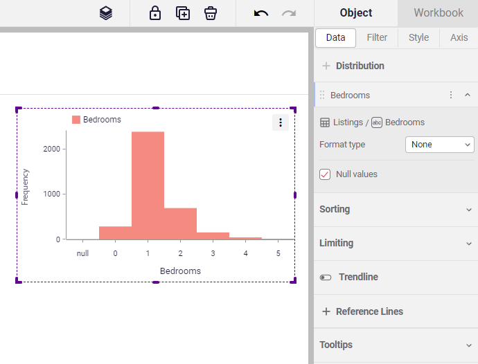
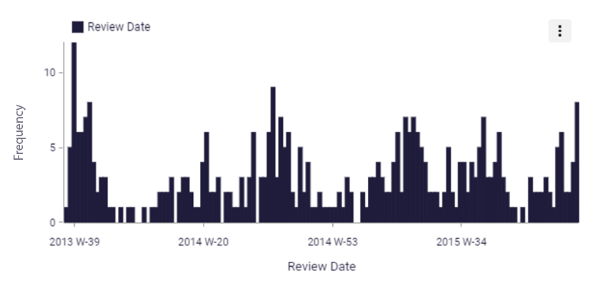
Astrato’s new Histogram object is designed to give you a clearer understanding of the distribution of your quantitative data, helping you identify important insights that might be otherwise hidden – like gaps or outliers. For example, what do you see in the ‘Review date’ histogram, above? Even just at a glance, several dates have a frequency score of zero, and might need further inspection!
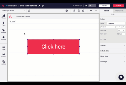
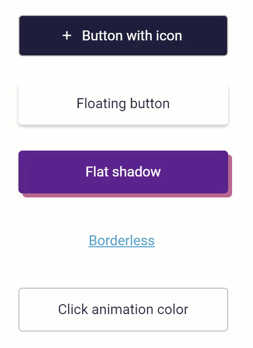
New style and icon options for Button Control
A few weeks ago, on the Astrato Galaxy page, a member of our online community commented:
“It would be nice to be able to add a shadow below a button to create the floating action button effect [and] it would be great to be able to add an icon to a button”
Now, we are happy to say that their ask has been answered… and then some! Customization is one of our key priorities at Astrato, and this user suggestion got us thinking. With a view to empowering users to style their objects with pixel-perfect control, our product team set to work making exciting improvements to Astrato’s Button Control.
Here’s a quick rundown of the key changes we’ve made:
- The button can now display an icon on the left of the button label. Enable the icon and choose from a wide variety of icons. The icon color is configurable for both the default and hover states.
- Enable and customize a drop shadow for the button’s default state. When enabled, it’s possible to configure the color, the offset, and the blur of the drop shadow.
- Configure the look of the button when the mouse cursor hovers over the button. Settings include text color, background color, icon color, border, and drop shadow.
- Change the color of the click animation to fit with your brand colors. Add that finishing touch with distinctive, recognisable design.
We’re always working to improve our platform based on user feedback, so stay tuned for more updates from the Astrato product team!
In the meantime, read more about this update in the Astrato Release Notes from March 14th.
Query Profile Insights to help you harness Snowflake’s powerful new function
Query performance is a key component to accelerating speed to insight in the most efficient way possible.
To help users increase query efficiency, Snowflake recently introduced a new table function, GET_QUERY_OPERATOR_STATS, which returns statistics about individual operators within a query. With this new function, a data expert may detect inefficiencies and suggest improvements. For example, they may notice a warning of “memory spilling”, and they may decide to fix the problem by changing the size of the warehouse. This is an invaluable asset, but Astrato users are not always data experts!
And that’s where Query Profile Insights comes in.
At Astrato, we created Query Profile Insights to help you harness Snowflake’s powerful new function – without the need to code – by creating a unique, intuitive interface that gives red warnings when a query deserves attention. We identified four common types of query inefficiency – Cartesian, Union, Memory, and Pruning – and when a red warning appears, the user can simply press “copy result,” and send it on to their Snowflake administrator for further evaluation and action. We chose to display these four indicators because Snowflake specifically highlights them as examples of common mistakes that cause query inefficiency.
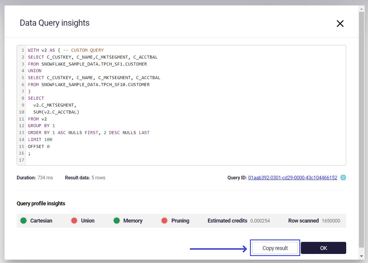
In addition to giving you a warning, Astrato’s Query Profile Insights panel also shows the number of rows scanned – this is not to be confused with the result data. As you can see in the image above, the final result of this particular query is five rows. But to achieve that result, Snowflake had to read 1.65M rows!
Finally, let’s talk about credits. You will be told how many credits you’ve used after you’ve made a query. This is like receiving a message detailing the total cost of your conversation after making a long international call. With this information, you can estimate how much future calls are going to cost you.
This is one of many efforts that Snowflake and our development team at Astrato are making to ensure that all users can save time and money (and CPU resource!) with the most efficient queries possible.
Visit our roadmap page for more information
And that’s only the start of it! For a complete list of everything we did in March – including loads of Actions, Data View Editor interaction improvements, and labels for bar charts – visit our Release Notes page, here.
Keep an eye out for next month’s roadmap update for all your product news, visit our product roadmap page, and connect with other ASTRATOnauts in Astrato’s online community, Astrato Galaxy, in the meantime.
