Cloud-Native BI Platforms for Snowflake & BigQuery: 9 Criteria
How to evaluate cloud-native BI platforms for Snowflake and BigQuery. A 9-criteria buyer’s framework with tests, vendor map, and a fillable scoring template.


Every BI vendor in your evaluation now claims to be cloud-native. Most of them are technically right, in the sense that they run in a browser and don’t ship as a desktop installer. That bar is too low to discriminate between tools, which means it’s too low to help you.
“Cloud-native BI” was a useful phrase in 2018, when half the market still ran on extracts pulled into a desktop app overnight. By 2026 it’s become the marketing equivalent of “user-friendly” — every vendor applies it, and none of them earn it. Your job is no longer to find a cloud-native BI platform. It’s to score the cloud-native BI platforms in your shortlist against criteria that actually separate them.
This article is for whoever’s running that evaluation. You’re on Snowflake, or BigQuery, or both. You’ve got three to five vendors on a shortlist. You’ve probably already opened a spreadsheet, or you’re about to. And you’ve heard “real-time,” “AI-powered,” and “warehouse-native” so often that those words have stopped registering as claims.
The 9 criteria below are the ones that hold up after a POC. For each, you’ll get a one-sentence definition you can paste into your rubric, the reason it matters specifically for Snowflake or BigQuery, a test you can run in an afternoon, and a link to a deeper article if you want to go further. At the end, there’s a scoring template you can copy into your spreadsheet.
TL;DR
Cloud-native BI is now table stakes. The evaluation worth running scores nine specific properties:
- live-query architecture
- cross-warehouse parity
- semantic layer architecture
- row-level security inheritance
- AI feature architecture
- embedded analytics depth
- self-service spectrum fit
- collaboration and review workflows
- and total cost of ownership architecture
Most criteria behave similarly whether you’re on Snowflake or BigQuery, but five of them diverge in ways you should know about: how RLS works, which AI stack you’re stuck with, how pricing scales, how real-time actually happens, and how mature the semantic layer is. At the end of the article, there’s a scoring template you can copy into your evaluation spreadsheet.
What “cloud-native BI” actually means in 2026
Here’s a working definition that survives scrutiny: a cloud-native BI platform queries the warehouse live without proprietary engines, runs in a browser without a desktop client, is multi-tenant by design, and inherits its governance from the warehouse instead of replicating it.
Five properties, all of which have to hold. Any one of them missing, and you’re looking at cloud-hosted, not cloud-native.
Live-query against the warehouse, not extracts. When you click a filter, the platform turns that into SQL and runs it against Snowflake or BigQuery, then renders the result.
It doesn’t pull your data into a proprietary cache, refresh nightly, and serve from there. Tableau Server with extracts is cloud-hosted. Power BI in import mode is cloud-hosted. The distinction is architectural, and it ends up shaping almost every other score on this rubric.
No proprietary engine. The platform doesn’t maintain its own query engine that the warehouse has to feed. Your warehouse is the engine. The BI tool generates SQL, ships it to Snowflake or BigQuery, and renders the response. Platforms that built their own column store fifteen years ago and have been migrating toward warehouse-native architecture since are not the same as platforms that started warehouse-native.
Browser-based, multi-tenant by design. No desktop client, no per-user installer, no version-skew problems between developers. Multi-tenant from the foundation up, which means the same platform serves your 50-person finance team and a SaaS company embedding analytics for 10,000 customers without a separate deployment.
Governance inheriting from the warehouse. Roles, row-level security, masking policies, audit logs — they all live in Snowflake or BigQuery. The BI tool reads them and respects them. It doesn’t maintain a parallel permissions layer that someone has to keep in sync. Governance drift is the failure mode auditors find first, and it’s entirely avoidable.
If a platform fails any of these, it’s cloud-hosted. The 9 criteria below assume you’re scoring tools that already pass this bar.
The 9 criteria, in evaluation order
1. Live-query architecture
A live-query BI platform turns your interactions into SQL that runs directly against Snowflake or BigQuery, with no extract layer in the middle. The dashboard is a renderer; your warehouse is the engine.
This matters for Snowflake because Snowflake’s pricing rewards short, well-formed queries against warmed warehouses, and live-query architectures are built to take advantage of that. It matters for BigQuery because BI Engine — Google’s in-memory acceleration layer — only kicks in when queries run live against BigQuery. If your BI tool caches its own copy of the data, BI Engine never fires, no matter what the marketing slide says.
Here’s the test. Open a SQL client and change a row in your warehouse. Then open the dashboard in the BI tool, and time how long until the change shows up without forcing a refresh. A live-query platform reflects the change on your next interaction. An extract-based platform shows it after the next scheduled refresh, which might be hours away. Watch out for tools that say “DirectQuery” or “Live connection” as a mode — it usually means those modes are available but not the default, and the dashboards your team will actually build won’t use them.
If you want a deeper look at how this property cascades into freshness guarantees, Real-Time Analytics on Snowflake walks through it. The short version for this rubric: when criterion 1 fails, criteria 4 (RLS) and 5 (AI architecture) usually fail with it, because both depend on queries running where governance and AI features actually live.
Astrato, Sigma, and Hex are live-query by default. Looker is live-query by default on BigQuery. Tableau and Power BI both support live-query modes, but in most enterprise deployments they default to extracts — which is the single most-misread architecture decision in BI evaluations.
2. Cross-warehouse parity
Cross-warehouse parity is the degree to which a BI platform behaves the same way when you point it at Snowflake or at BigQuery. A platform with parity feels like one product across both warehouses. A platform without parity feels like a Snowflake product that happens to connect to BigQuery, or vice versa.
There’s no deep article in this cluster on cross-warehouse parity, because it’s native to this evaluation. It matters because most organizations running a serious BI evaluation in 2026 are either multi-warehouse already (Snowflake for production analytics, BigQuery for marketing data, often inherited from acquisitions) or hedging against future warehouse migration. If your BI tool locks you to a single warehouse, you’ve recreated the lock-in problem you adopted Snowflake or BigQuery to escape.
Here’s the test. Build the same dashboard against a Snowflake schema and a BigQuery dataset that contain equivalent data. Then check four things: does every visualization work on both, does the semantic layer model identically, does query performance feel comparable on the same workload, and does the AI feature set work on both — or only on one. The first two should be a yes. The third varies by warehouse-side optimization. The fourth is where most platforms reveal their bias.
Sigma is strong on Snowflake and adequate on BigQuery; its performance optimizations are tuned for Snowflake first. Looker, owned by Google, has the inverse profile: strongest on BigQuery, capable on Snowflake. Astrato is one of the few platforms with the same architecture, the same product, and the same evaluation across both, plus Databricks, Redshift, ClickHouse, PostgreSQL, Supabase, Dremio, and MotherDuck — multi-warehouse is the foundation, not a connector list. Tableau and Power BI connect to both. Whether you actually have parity depends on whether you’re using them in extract mode (which abstracts the warehouse away entirely) or live-query mode (where the parity gap shows up clearly).
3. Semantic layer architecture
The semantic layer is where your business definitions live in code — what counts as an active customer, how you recognize revenue, which orders are returns. Where it sits, who owns it, and whether you can version-control it outside the BI tool decides whether the same metric means the same thing in every dashboard, model, and reverse-ETL pipeline you run.
Three viable patterns in 2026:
- The BI tool defines it — Looker through LookML, Astrato through its in-platform semantic model, ThoughtSpot through TML. Pro: integrated authoring. Con: a second source of truth alongside your warehouse.
- The warehouse defines it — Snowflake Semantic Views, BigQuery’s emerging semantic capabilities. Pro: single source of truth, native governance. Con: you’re early on the maturity curve.
- A third-party semantic layer — dbt semantic layer, Cube. Pro: consistent definitions across tools. Con: more moving parts.
Here’s the test. Ask yourself whether a metric definition can survive a vendor change. If your “monthly recurring revenue” lives in LookML and you swap Looker for another platform, are you rebuilding the metric from scratch, or migrating the definition? Platforms that store semantic definitions in version-controllable text files — LookML, Cube YAML, dbt semantic layer — score highest on portability. Platforms that hide definitions in opaque binary formats inside the BI tool score lowest.
For the longer treatment of how the semantic layer fits into a warehouse-native architecture, How to Build a Data Product on Snowflake lays out the reference architecture. The short version: the semantic layer is the contract between your warehouse and every consumer. The BI tool is one consumer. A well-designed semantic layer also feeds embedded analytics, reverse-ETL, and AI agents.
Watch out for platforms that claim to have a semantic layer but treat it as optional. AI without business context is the failure mode that has burned every text-to-SQL POC for the last three years.
4. Row-level security inheritance
A BI platform inherits row-level security when it respects the access policies you’ve already defined in Snowflake and BigQuery, instead of asking you to recreate them in a parallel layer. Your user logs in, the warehouse decides which rows that user can see, and the dashboard renders only those rows. No sync job, no admin panel in the BI tool, no drift.
This matters because both warehouses now ship with mature RLS primitives. Snowflake’s row access policies attach SQL expressions to tables, filtering rows based on the current user’s role and session context. BigQuery’s row-level security uses authorized views and policy tags to do the same thing through a different mechanism. Either way, your warehouse becomes the single source of truth for who-sees-what — but only if the BI tool inherits that, instead of fighting it.
Here’s the test. Define an RLS policy in Snowflake or BigQuery that restricts a sensitive table to a specific role. Add one user to that role and another user without it. Have both users open the same dashboard. The first user should see the data; the second should see an empty result or a permission error. If the platform makes you also configure user-level filters in the BI tool to make this work, RLS inheritance has failed — you now have access policies living in two places, and they’ll drift.
The deeper version of this discussion is in BI Platforms with Native Row-Level Security on Snowflake, which sorts eight platforms into three patterns: full inheritance, partial inheritance with BI-side overrides, and parallel implementation. The short version for this rubric: tools that pass user identity straight through to the warehouse score highest. Tools that maintain their own user directory and translate to the warehouse score in the middle. Tools that ask you to configure RLS again in the BI layer score lowest.
One note on warehouse divergence: Snowflake’s row access policies and BigQuery’s authorized views give you roughly equivalent capability, but the syntax and operational model are different. When a BI tool says it inherits both, what you’re really checking is whether the platform’s identity and SSO flow correctly map your authenticated user into both warehouses. Confirm this in the POC. Don’t take it on the data sheet.
5. AI / generative features architecture
AI architecture in a BI platform comes down to two questions: where does your data go when AI features run, and which large language models can you actually use? A natural-language-to-chart feature that ships your data to a third-party API and locks you to one model has a very different procurement and security profile than one running inside Snowflake Cortex with multiple model choices.
Four architectural patterns:
- Warehouse-resident AI — Snowflake Cortex (multi-model: Anthropic Claude, OpenAI, Meta Llama, Mistral, DeepSeek) and BigQuery’s Gemini integration (Google’s models). Your data doesn’t leave the warehouse. Governance and audit logs cover the AI calls the same way they cover SQL.
- Third-party API — the BI tool ships rows of your data to OpenAI or Anthropic via the public API. Data leaves the warehouse. Whether that’s acceptable depends on your data residency, your contract, and your customers’ compliance teams.
- Bring-your-own-LLM — the platform calls a model endpoint you provide, including a private deployment.
- Mixed — different AI features use different patterns, and often the difference isn’t made obvious to you.
Here’s the test. Ask the vendor to draw the data path from a user typing a natural-language question to the response showing up in the dashboard. Mark every box where your data crosses a security boundary. The right question isn’t “do you have AI features?” — every vendor will say yes. The right question is “where does my data go when those features run, and who decides which model handles it?”
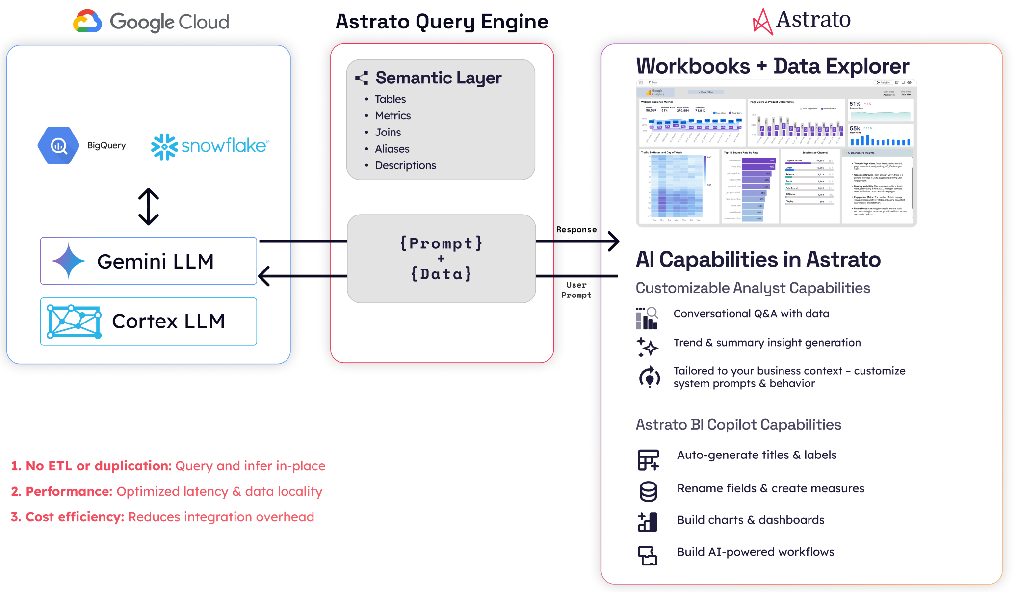
For the longer treatment, Choosing an AI-Native BI Platform for Snowflake walks the full framework. The structural divergence between Snowflake and BigQuery is sharpest here: Snowflake Cortex gives you multi-model choice including non-Google models, while BigQuery’s Gemini integration is Google-locked. If your procurement requires non-Google models, that’s a BigQuery constraint, not a BI tool constraint — but your BI tool’s AI architecture has to be flexible enough to run Cortex on the Snowflake side and something else on the BigQuery side. Astrato’s multi-LLM architecture (Cortex, Gemini, OpenAI, BYO) is one of the few that maps cleanly to that constraint. ThoughtSpot, Sigma, and Hex have varying degrees of model lock-in worth checking against your specific requirements.
6. Embedded analytics depth
Embedded analytics depth is how invisibly a BI platform’s dashboards integrate into your customer-facing product. It covers white-labeling, multi-tenant context, embedding modes, and identity flow. Get it right, and your customers can’t tell the dashboards apart from the rest of your product. Get it wrong, and the dashboards look like a third-party tool bolted on.
This matters because the buyer evaluating cloud-native BI is increasingly the same person evaluating customer-facing analytics. Your warehouse holds the customer-facing data product as well as the internal one. If your BI tool handles both, your stack stays smaller. If it can’t, you’re going to need a second tool — and the deep articles on customer-facing analytics in this cluster are your next read.

Here’s the test. Look at the dashboard inside a real product mockup, not the vendor’s demo environment, and ask: would your customer recognize this as a third-party tool from the URL bar, the fonts, the color palette, the loading spinner, the error states, or the interaction model? Then check the four common embedding modes — full iframe, headless component SDK, single-chart embed, and full-page take-over — and confirm which ones the platform actually supports without compromise.
Multi-tenant context is the second axis. Single-tenant embedding is the easy case: every customer sees the same dashboard against your data. Multi-tenant embedding is harder — each customer has to see a dashboard scoped to their data, with their branding, their users, and their permissions, all served from the same deployment. The architectural test: does the platform pass user identity and tenant ID into the warehouse query at runtime, or does it want a separate dashboard per tenant?
The reference architecture for embedded BI on Snowflake — including Astrato’s iframe / SDK / component options and multi-tenant patterns — is in the data products article. For the BigQuery-specific treatment, Embedded Analytics for BigQuery goes deeper. Sigma and Hex have credible embedded stories. Looker’s embedded experience is mature on BigQuery. Tableau and Power BI’s embedded modes show their extract-era origins more visibly than the rest. Metabase has a low-cost embedded tier that works fine below a certain scale and breaks above it.
7. Self-service spectrum fit
Self-service in BI isn’t a binary; it’s a spectrum from “analysts only” to “any business user can build a dashboard from scratch.” The right tool sits where your users actually live. A platform tuned for analysts will frustrate your non-technical finance team. A platform tuned for business users will frustrate your senior data engineer.
Four bands on the spectrum, and a rubric question for each.
- Analyst-only — you need SQL or LookML to build anything useful. Hex sits here. Looker sits here for authoring; viewers can use the dashboards an analyst built.
- Curated self-service — your analysts build the semantic layer and certified dashboards, and your business users explore within those guardrails. Most enterprise deployments of Tableau, Power BI, and Sigma operate this way in practice.
- Drag-and-drop self-service for business users — non-technical users can build dashboards from scratch in a visual interface, with the semantic layer doing the heavy lifting underneath. Astrato sits here. Sigma sits here for spreadsheet-fluent users.
- Search-led self-service — your users ask questions in natural language. ThoughtSpot built the category. Most platforms now have a chat interface, and whether it counts as self-service depends on whether the answers are trustworthy enough to act on (which loops you back to criterion 3).
Here’s the test. Hand the tool to a finance manager who knows Excel but doesn’t write SQL. Time how long until they build a useful dashboard from scratch — not modify an existing one. Then run the same test with an analyst. The gap between those two times tells you which band the tool actually serves, regardless of where the marketing places it.
The longer treatment is in Self-Service BI on Snowflake, which maps eight platforms onto the four-band spectrum. It’s the right read for any team where the answer to “who needs to self-serve” includes more than one persona. The temptation in evaluations is to optimize for the most-technical user. The failure mode is buying a tool the rest of your org won’t actually use.

8. Collaboration and review workflows
Collaboration in BI covers four workflows — sharing, commenting, version control, and review-and-approval. It discriminates strongly between platforms built for individual analysts and platforms built for teams. Sharing a dashboard link is the floor. A genuine review workflow with approvals, change requests, and audit trail is the ceiling.
This matters less than criteria 1 through 7 for most evaluations, which is why it sits at #8 instead of higher. But it matters more than criterion 9 if your team is shipping dashboards to executives or to customers, where “is this dashboard approved?” is a real question someone’s going to ask. Hex’s notebook-based collaboration — comment threads tied to specific cells, version history at the cell level — is the current category leader. Looker’s chat integration via Google Workspace is solid for Google-first organizations. Astrato, Sigma, and Tableau ship competent but not differentiated collaboration: the workflows exist, they work, they’re not why you’d choose the platform.

Here’s the test. Walk through a dashboard review-and-approval workflow end to end. An analyst builds a dashboard. A reviewer opens it and leaves comments tied to specific charts. The analyst responds, makes the changes, and the reviewer approves. Then check three things: is the comment history visible to anyone who opens the dashboard later, is the version history navigable, and is there an audit log showing who approved what and when. The platforms that pass this cleanly tend to be the analyst-leaning ones. The platforms that fail tend to be the business-user-leaning ones — which surfaces a real trade-off, since depth of collaboration tends to correlate with depth of analyst-orientation.
There’s no deep article on collaboration in this cluster yet. The honest reason is that it hasn’t cleared the bar of being differentiated enough to write 3,000 words about. If your evaluation has collaboration in the top three criteria, your team is probably analyst-leaning, and the AI-native and self-service articles are your closest reads.
9. Total cost of ownership architecture
TCO architecture is the relationship between a BI platform’s pricing model and your warehouse’s pricing model. Aligned models scale together; competing models diverge. Per-seat pricing punishes broad self-service. Per-query pricing punishes interactive exploration. Capacity-based pricing usually aligns with warehouse spend. OEM pricing is its own thing if you’re embedding.
This is the criterion most evaluations get wrong, because the easy comparison is sticker price and the hard one is the shape of the curve over three years.
Here’s the test. Model your cost at three points: where you are today, twice your current scale, and ten times your embedded customer count if you have an embedded use case. Then look at the shape of the curve. If a vendor’s cost grows roughly the way your warehouse cost grows, you’re aligned. If their cost climbs faster — usually because per-seat licenses pile up the moment adoption actually works — they’re competing with your warehouse spend rather than riding alongside it.
There’s a Snowflake-vs-BigQuery divergence worth naming here. Snowflake’s per-second compute pricing rewards short, bursty interactive workloads. BigQuery’s per-query slot pricing rewards predictable, batch-shaped workloads. The same BI tool generating the same queries against both warehouses will produce different cost curves. That’s not the BI tool’s fault, but it does mean you should run criterion 9 separately for each warehouse rather than averaging.
The honest landscape:
- Metabase has the lowest TCO at small and mid scale, with a strong open-source path.
- Astrato’s pricing is consumption-based on the warehouse side, with usage-based tiers for embedded analytics that support unlimited end viewers — competitive, but not the cheapest.
- Sigma and Looker tilt toward per-seat at the enterprise tier, which scales fast once broad self-service catches on.
- ThoughtSpot has historically tilted per-seat at the enterprise tier too. Tableau and Power BI vary more by deployment shape than any single number captures.
If the cheapest option is the right answer, you don’t need 9 criteria. The reason this article has 9 is that the right answer is rarely the cheapest one — but it’s also rarely the most expensive, and criterion 9 is the discipline that keeps the other 8 honest.
Where Snowflake and BigQuery evaluation diverges
Most criteria score similarly on both warehouses. Five diverge meaningfully enough that you should know what you’re looking at.
Real-time mechanism. BigQuery’s BI Engine is an in-memory acceleration layer that fires when your BI tool’s queries run live against BigQuery. Snowflake’s result cache stores recently-computed query results and serves them on subsequent identical queries. Different mechanisms, similar outcomes — but you only benefit from either if your BI tool is live-query. Extract-based tools get neither.
Row-level security. Snowflake’s row access policies attach SQL expressions to tables. BigQuery’s row-level security uses authorized views and policy tags. The capabilities are roughly equivalent; the syntax and operational model differ. A BI platform’s RLS inheritance has to handle both, and that’s something you should confirm in a POC, not on a data sheet.
AI feature stack. Snowflake Cortex is multi-model — Anthropic Claude, OpenAI, Meta Llama, Mistral, DeepSeek — with model choice per workload, all running inside your Snowflake account. BigQuery’s Gemini integration is Google-locked. If your procurement requires model choice, Snowflake gives it to you natively and BigQuery doesn’t. Either way, your BI tool’s AI architecture has to be flexible enough to use the warehouse-native option on each side, which is harder than the data sheets suggest.
Pricing model. Snowflake’s per-second compute pricing favors short, bursty interactive queries. BigQuery’s per-query slot pricing favors predictable, batch-shaped queries. The same BI tool generating the same queries against both warehouses will produce different cost curves. Run criterion 9 separately against each warehouse, not as an average.
Semantic layer maturity. Both warehouses now have native semantic capabilities. Snowflake Semantic Views are further along; BigQuery’s equivalents are still emerging. That gap means BigQuery deployments more often rely on dbt semantic layer or Cube as the canonical semantic source, while Snowflake deployments increasingly use Snowflake Semantic Views directly. Whichever side you’re on, your BI tool’s semantic layer story has to accommodate the pattern that fits.
If the article you’re reading on cloud-native BI doesn’t name divergences in this much detail, you’re reading a Snowflake article with “and BigQuery” appended.
Vendors mapped to the framework
This is a light map, not a deep capsule per vendor. The point of the rubric is that you score against your own requirements; what follows is a starting calibration.
Two ways to read the table. Down a column tells you which vendors win on a single criterion. Across a row tells you which vendors win on the criteria you weighted highest. The honest finding is that no vendor scores Strong across all 9. Astrato’s profile is heavy on architectural criteria (1, 2, 3, 4, 5, 6, 7) and middle on operational ones (8, 9). Power BI’s profile is the inverse. Tableau is the safest middle. Metabase is the cheapest. Looker is the deepest semantic story on BigQuery. The rubric is what you weight, not what we recommend.
The scoring template
Copy this into your evaluation spreadsheet. The 5-point scale is deliberately coarse — finer scales tempt you into false precision when comparing vendors.
Score each criterion 1–5. Weight them according to your priorities — most evaluations should weight 1, 2, and 3 highest, and 8 and 9 lowest, but yours might differ.
Want to see what live-query, cross-warehouse, and warehouse-native AI look like in practice? Start a free trial of Astrato or book a 30-minute demo to walk through the 9-criteria rubric on your own Snowflake or BigQuery data.
FAQ
What is cloud-native BI?
Cloud-native BI is a category of business intelligence platform that queries the warehouse live without proprietary engines, runs in a browser without a desktop client, is multi-tenant by design, and inherits governance from the warehouse. Tools that meet all four are cloud-native. Tools that meet one or two are cloud-hosted.
How is cloud-native BI different from cloud-hosted BI?
Cloud-hosted BI runs in the cloud but still operates as if it were desktop software — extracting your data, caching it, refreshing on a schedule, and maintaining its own access controls. Cloud-native BI treats the warehouse as the source of truth and the engine, generating live queries instead of running its own copy of your data.
Which BI platforms work well with both Snowflake and BigQuery?
In 2026, the platforms with the strongest cross-warehouse parity are Astrato (architecturally multi-warehouse from the foundation up), and Tableau and Power BI (broad connector libraries, though with extract-era defaults). Sigma is strongest on Snowflake; Looker is strongest on BigQuery. Cross-warehouse parity is criterion 2 in the rubric above.
What is the most important criterion when evaluating cloud-native BI?
For most evaluations, criterion 1 (live-query architecture) is the foundation — it shapes how criteria 4 (RLS), 5 (AI), and 9 (TCO) actually behave. If you’re embedding, criterion 6 (embedded depth) takes over. If your team is analyst-heavy, criterion 3 (semantic layer) takes over. The right weighting depends on what your team will actually do with the tool.
Is the cheapest cloud-native BI usually the best?
No. The cheapest option — often Metabase at small to mid scale — is usually the best on criterion 9 alone, but not on criteria 1 through 8. The reason this framework has 9 criteria is that the right answer is rarely the cheapest one — but it’s also rarely the most expensive. Criterion 9 keeps the other 8 honest.
Ready to experience next-gen analytics?
See how Astrato runs natively in your warehouse.