The question every analyst dreads
Someone in leadership opens Slack on Monday morning: "Revenue is down 4%. Why?"
What follows is a familiar scramble. You open the revenue dashboard, then a regional breakdown in a second tab, then a product-level view in a third. You cross-reference filters, copy numbers into a spreadsheet, and forty-five minutes later you have a hypothesis. Maybe it was APAC. Maybe it was a single product line. The answer was always in the data — it was just scattered across five different views with no connective tissue between them.
This is the gap KPI Tree is built to close. It is a single chart type that decomposes any top-level metric into its constituent drivers, so you can trace movement from the headline number all the way down to the root cause — without switching dashboards, without exporting to Excel, and without losing your audience along the way.
How it works
At its simplest, KPI Tree connects a parent metric to the dimensions and measures that explain it. You define the hierarchy — say, Revenue → Region → Product → Channel — and each node renders as a KPI card showing the current value, the period-over-period change, and a directional indicator. Positive and negative colour-coding propagates through connector lines, making outliers visible at a glance without needing to read every card.
The layout is interactive by default. Select a node and everything downstream filters automatically. Hover to brush related measures across the tree. Expand or collapse branches to control the depth of detail visible at any moment. Bookmarks preserve the exact state — expansion level, selected nodes, applied filters — so you can save a specific drill-path and share a link with a stakeholder who sees exactly what you saw.
Because Astrato is warehouse-native, every node in the tree queries your Snowflake, BigQuery, Databricks, ClickHouse or any other modern warehouse directly. There are no extracts, no stale caches, no intermediate data layer. The number you see on the card is the number in your data platform, right now.
Three modes, one visual language
KPI Tree ships with three layout modes that share the same card design, so you can mix them on a single dashboard without visual friction.
KPI Row — the executive snapshot

When you need a fast status check rather than a deep analysis, KPI Row lays a set of metrics side by side in a single object: Revenue, Conversion, Churn, Net New ARR — whatever matters this week. Each card shows the current value, the period-over-period change, and a colour-coded bar so you can read direction at a glance. Same card format as the tree, keeping the visual language consistent across your reports.
Best for: weekly reviews & board decks

KPI Trellis — spot outliers fast
Take a single metric and split it across a dimension — Region, Device Type, Customer Segment, or in this case, neighbourhood. Each value becomes its own card in a scannable grid. You are not explaining hierarchy here; you are identifying which group leads and which lags. Revenue by Region. Churn by Cohort. Win Rate by Sales Rep. The trellis delivers the comparative scan in seconds that would otherwise require a pivot table.
Best for: dimensional comparison & outlier detection

KPI Tree — explain root cause
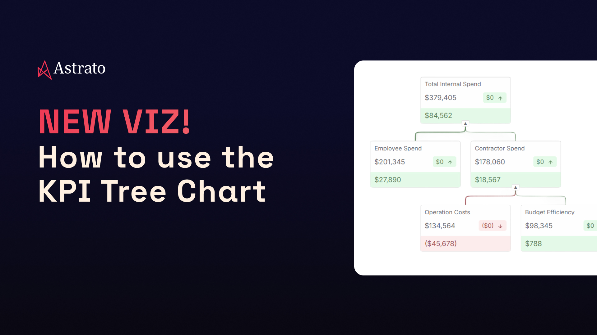
The full decomposition view. Start with a headline KPI at the top, break it into first-level drivers, then drill further. Each node shows the value and the change, so you can follow the trail from top to leaves. In this example, Total Internal Spend breaks into Employee and Contractor spend, revealing that Operation Costs drive the negative movement — colour-coded in red so the critical path is unmistakable.
Best for: root-cause analysis & performance narratives
Setting it up (four steps)
Configuration is deliberately simple. Four steps from a blank canvas to a working tree:
1. Define your nodes. Choose a set of dimensions with a single KPI, or go multi-measure with several KPIs mapped across a hierarchy. Both approaches work; the choice depends on whether you are decomposing one metric or monitoring several.
2. Pick a layout. Tree for causal analysis (top-down or left-to-right orientation). Cards for a flat overview. You can change this at any time without losing your node configuration.
3. Style the cards. Set number formats (percentage, currency, compact notation), define colour rules for positive-versus-negative movement, and toggle segment visibility. The goal is that any viewer immediately understands whether a number is good or bad without needing a legend.
4. Organise the hierarchy. Drag and drop cards into the parent-child structure that matches your mental model of the business. This is where you decide that Revenue breaks into Regions, Regions break into Product Lines, and Product Lines break into Channels.
Capabilities at a glance
Interactive by default
Node selection filters downstream. Brushing highlights related measures on hover. Bookmark support preserves expansion state, zoom level, and selections. Works with existing dashboard-level filters.
Flexible layout
Top-down or left-to-right orientation. Auto-fit adapts to screen size. Stable node positioning when expanding branches. Default expansion state controllable via variables.
Clear visual signals
Positive/negative colouring with customisable thresholds. Directional arrows on every card. Connector lines inherit colour from child nodes, so the critical path lights up without extra configuration.
When to reach for each mode
A simple decision framework:
✨ Need a status check? Use KPI Row. Fast, flat, no hierarchy.
✨ Need to compare a metric across groups? Use KPI Trellis. One KPI, many values, instant scan.
✨ Need to explain why a number moved? Use KPI Tree. Full decomposition, root-cause visibility.
All three share the same card design, so they combine naturally on a single dashboard: a Row at the top for the headline numbers, a Trellis below it for the dimensional scan, and a Tree at the bottom for the deep dive. Consistent formatting, no context-switching, and the entire story on one page.
Try it now
KPI Tree is available today in Astrato. If you are already on the platform, add a KPI Tree visual to any existing dashboard and start decomposing your metrics. If you are evaluating Astrato for the first time, start a free trial and connect your Snowflake, BigQuery, Databricks warehouse in minutes. No extracts required — just point it at your data and build.


.avif)


