9 Best Tableau Alternatives for 2026
Compare 9 Tableau alternatives by architecture, pricing, AI features, and ease of use. Includes real user reviews and watch-out-for sections for each platform.

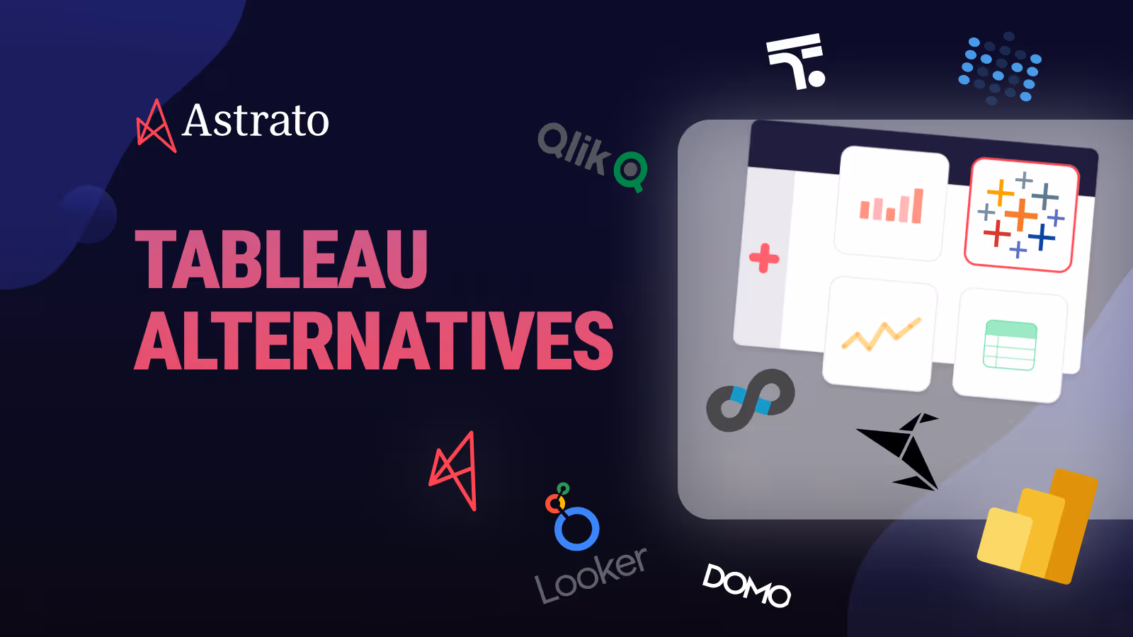
Tableau put data visualization on the map. For years, it was the gold standard among business intelligence tools for turning messy spreadsheets into beautiful, interactive dashboards. But somewhere between rising license costs, extract refresh failures at 3 AM, and non-technical users giving up and going back to Excel, a lot of teams started asking the same question:
Is there something better out there?
If you’re reading this, you’ve probably hit at least one of those walls yourself. Maybe your Tableau environment has become an unmanageable jungle of workbooks. Maybe you’ve migrated your data to a cloud warehouse like Snowflake or BigQuery and realized Tableau still wants to copy everything into its own extract layer. Or maybe the bill just landed on your desk and you’re wondering why a data analytics tool costs more than some of your actual data infrastructure.
Whatever brought you here, this guide is built to help you find the right BI tool for your team.
Comparison at Glance
Before diving into each platform, here’s a quick comparison across the factors that matter most when evaluating alternatives to Tableau. This should help you narrow down which BI tools deserve a closer look based on your specific needs.
Top 9 Tableau Alternatives
We’ve put together a list of nine alternatives to Tableau, each solving a different set of problems. Some are direct competitors. Some take a completely different approach to data analysis and data visualization. All of them are worth knowing about if you’re evaluating what comes after Tableau.
1. Astrato — Best for Warehouse-Native, Live-Query BI
Astrato is a warehouse-native business intelligence platform built from the ground up for teams running on any major cloud warehouse. Instead of extracting data into a separate BI layer, Astrato queries your warehouse directly for real-time data analysis. Think of it as a visualization and self-service analytics layer that sits on top of your warehouse without ever copying your data.
Why Astrato?
- Live-query architecture: Every dashboard shows real-time data because queries execute directly in your warehouse. No extracts, no refresh schedules, no stale reports. Your warehouse’s caching and data connectivity do the heavy lifting, so you get data insights that are always current.
- No-code drag-and-drop interface with a semantic layer: Business users can create interactive dashboards using a drag-and-drop interface without writing a single line of code. Metrics and dimensions are defined once in a central semantic layer — the data modeling is done for them — and reused everywhere, which means “revenue” means the same thing in every dashboard across the organization.
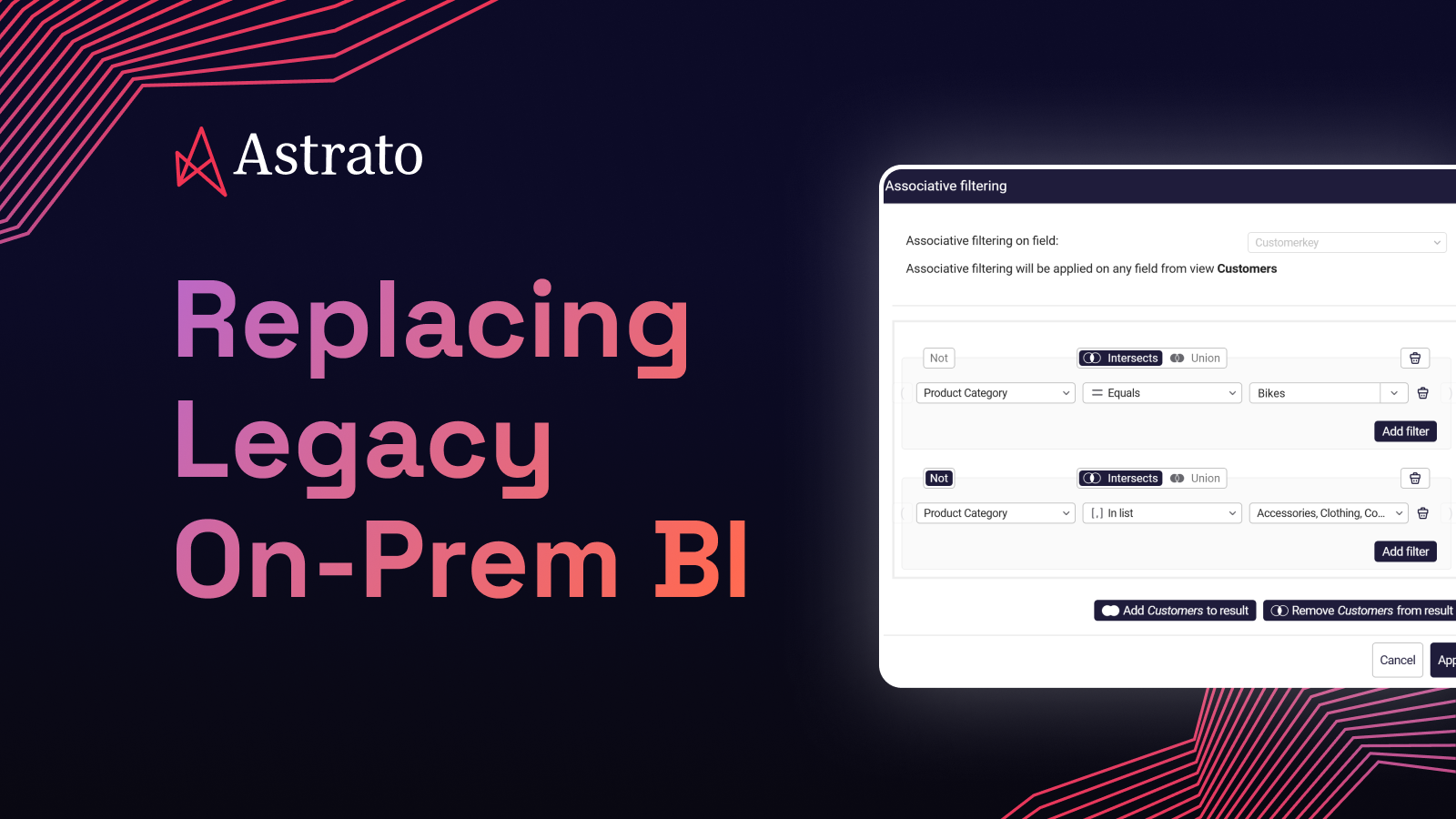
- Pixel-perfect embedded analytics: Need to embed customizable dashboards in a customer-facing product or build custom app experiences around your data? Astrato supports full white-labeling with no-code customization. Match your brand’s fonts, colors, and layout without touching an SDK. Multi-tenant data security is built in from day one.
- Writeback and operational workflows: Dashboards aren’t read-only. Astrato allows users to update forecasts, approve budgets, or enter data directly, and changes sync back to the warehouse with full governance. This turns analytics from something you look at into something that drives business processes in just a few clicks.
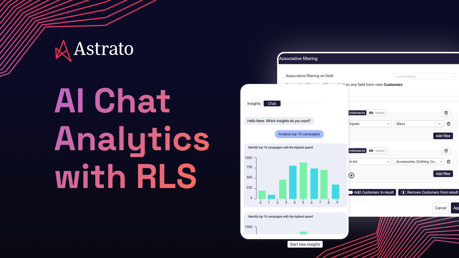
- AI-powered insights (native LLM integration): Astrato connects to Snowflake Cortex, Google Gemini, OpenAI, or bring-your-own LLM. Users can ask natural language queries and get AI-powered data insights. Because the AI sits on top of a well-defined semantic layer, it understands your business context and generates accurate queries — not guesses.
- Scheduled production reports: Export pixel-perfect reports and dashboards as PDF, PowerPoint, or Excel on a schedule. Design templates once, populate them with live data, and deliver them automatically to stakeholders or clients.
What Users Are Saying
Teams switching from Tableau and Qlik consistently highlight the speed of deployment and the quality of visualizations. Customers report 50–75% cost savings compared to legacy BI tools, with 25–50% faster dashboard development. Users especially praise the no-code experience and how quickly non-technical users can start self-serving, which enables true self-service analytics across the organization.
Pricing
Usage-based, tied directly to warehouse compute consumption. No distinction between user types — a license is a license. This makes it a scalable solution that stays cost-efficient as you grow to hundreds or thousands of users, especially for embedded analytics scenarios.
Astrato Is Best for
Teams that have invested in a modern cloud data warehouse (Snowflake, BigQuery, Databricks) and want their BI layer to match. Particularly strong for organizations that need embedded customer-facing analytics, custom dashboards with operational workflows and writeback, or a path to replace legacy BI without months of migration effort.
Watch Out For
Astrato is purpose-built for cloud warehouses. If your data doesn’t live in Snowflake, BigQuery, or Databricks or any other major warehouse, it won’t be the right fit. It’s also a newer player in the market, so while the product consistently wins in proof-of-concept evaluations, it doesn’t yet have the brand recognition of a Tableau or Power BI.
For a full comparison, check out our Astrato vs. Tableau review.
2. Microsoft Power BI — Best for Microsoft-First Teams
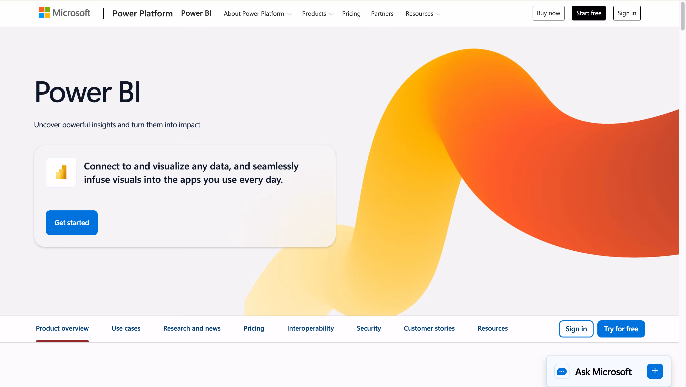
Power BI is Microsoft’s business intelligence platform, tightly woven into the Azure and Microsoft 365 ecosystem. It offers a free desktop application for report authoring and cloud-based sharing through the Power BI Service. If your company already runs on Microsoft tools, Power BI offers seamless integration and is often the path of least resistance for data-driven decision-making.
Why Power BI?
- Deep Microsoft integration: Connects natively to Excel, Azure, SharePoint, and Teams. You can connect data from across your business systems without friction. For organizations already paying for Microsoft 365, Power BI fits into existing workflows as a natural extension.
- Copilot AI integration: Microsoft’s AI assistant can help generate reports, summarize data, visualize data in new ways, and answer natural-language questions about your dashboards.
Large community and talent pool: Finding someone who knows Power BI is easier than finding expertise for most other BI tools. The community forums, documentation, and third-party training resources are extensive.
What Users Are Saying
Users appreciate the low entry price and the tight integration with Excel. However, reviews consistently mention a steep learning curve for DAX (Power BI’s formula language) and Power Query (M language) for data preparation. Many users report that data modeling and creating advanced reports requires specialized technical expertise that’s hard to hire for. Performance with large datasets in DirectQuery mode is another frequent complaint.
Pricing
Power BI Pro is $14/user/month (increased from $10 in April 2025). Premium Per User is $24/user/month. Power BI Premium capacity starts at $4,995/month. Note: both creators and viewers need paid licenses unless you invest in Premium capacity.
Power BI Is Best For
Organizations deeply embedded in the Microsoft ecosystem (Azure, Excel, SharePoint, Teams) that need affordable per-user licensing for internal reporting.
Watch Out For
The import-mode architecture means data is typically duplicated into Power BI’s own layer for acceptable performance. DirectQuery avoids this but comes with a 1M-row result set limit for rendering and can be expensive on warehouse compute. The complexity of DAX, capacity planning for cloud deployments (Premium/Fabric), and hidden infrastructure costs (gateways can add ~30% to TCO) are common surprises. If your data warehouse isn’t Azure-based, you’re working against the grain.
3. Looker (Google Cloud) — Best for Google Cloud & Governed Metrics
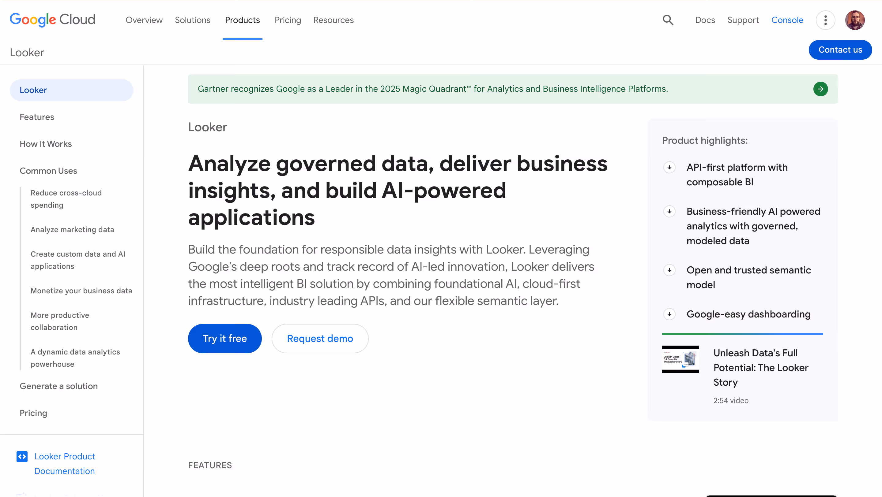
Looker is Google Cloud Platform’s enterprise BI platform, built around LookML, a proprietary modeling language that creates a centralized semantic layer for your data. It runs queries directly in your database (primarily BigQuery) and is designed for organizations that want strict metric governance and controlled data access across the business.
Why Looker?
- LookML semantic layer: Define your metrics, relationships, and business logic once in code, then reuse them across every dashboard and report. This enforces consistency and governance at scale.
- In-database architecture: Looker queries BigQuery (or other supported warehouses) directly, meaning you’re always looking at current data. No extracts to manage.
- API-first design: Looker’s REST API and embedding SDKs make it a strong choice for custom app building — creating analytics experiences or integrating BI into existing applications and business systems.
What Users Are Saying
Users praise the governance model and the power of having a single source of truth through LookML. However, the learning curve for LookML itself is a consistent pain point, as it requires developers who know both SQL and LookML syntax. Dashboard customization options are also considered more limited than competitors.
Pricing
Custom enterprise pricing. Looker does not offer self-service signup. Reports indicate starting costs of $36,000–$60,000/year for small deployments, scaling well into six figures for enterprise use. Viewer, Standard, and Developer user types are priced from roughly $30 to $125/user/month.
Looker Is Best For
Organizations that are all-in on Google Cloud and BigQuery, have developer resources available for LookML, and prioritize centralized metric governance above all else.
Watch Out For
The high price point and mandatory LookML expertise make Looker a poor fit for small teams or organizations without dedicated data engineering resources. There’s no free trial. Dashboard customization and visualization quality lag behind some competitors. If you’re not on Google Cloud, you lose much of the performance optimization.
4. Sigma Computing — Best for Spreadsheet-Savvy Analysts
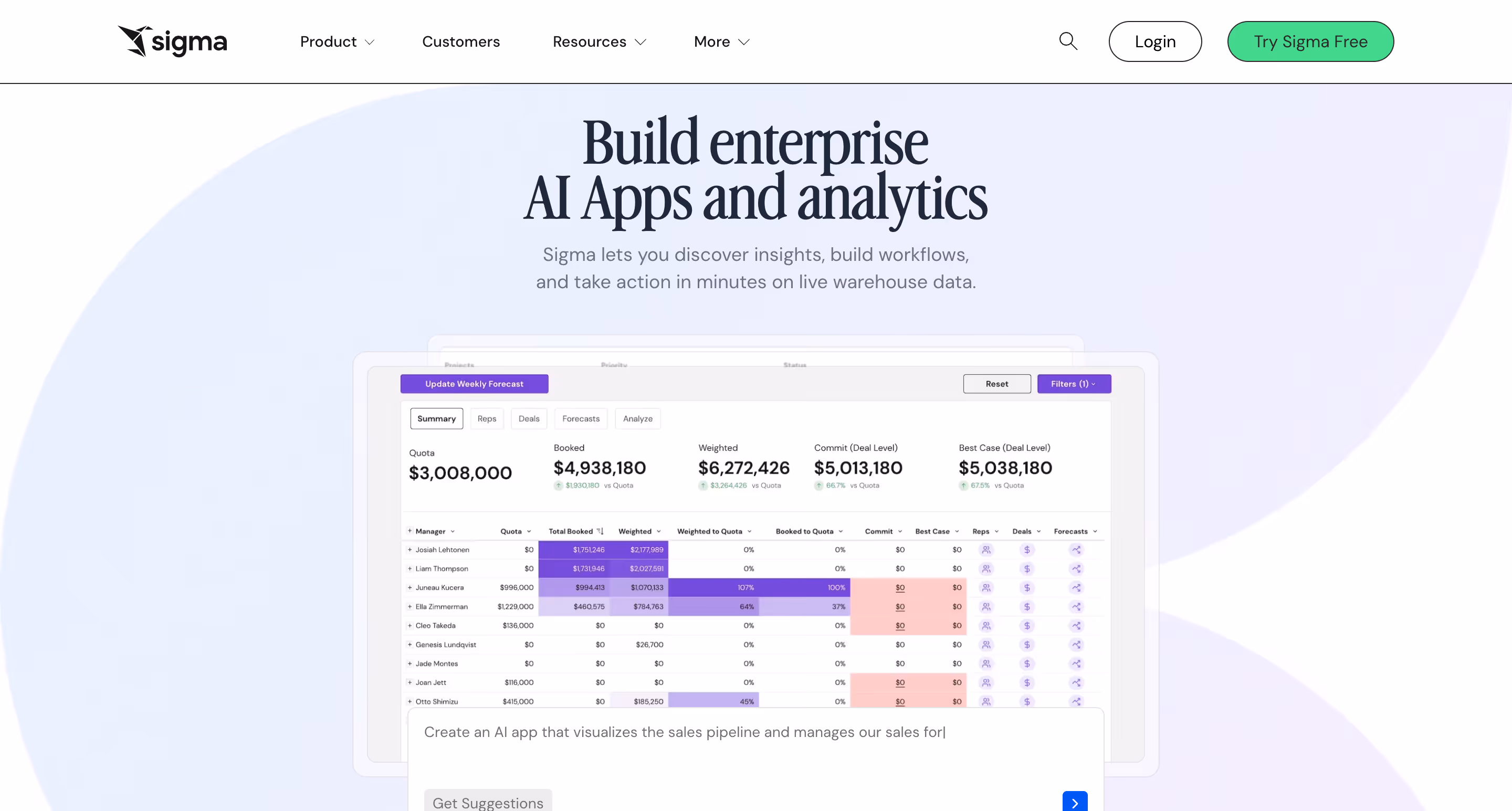
Sigma Computing is a cloud-native BI tool that connects directly to your warehouse and enables users to explore data through a familiar spreadsheet-like interface. If your analysts think in rows, columns, and formulas rather than drag-and-drop charts, Sigma was designed for them.
Why Sigma?
- Spreadsheet-first UI: Analysts who live in Excel or Google Sheets will feel at home. You can write formulas, create calculated columns, and group data without learning a new paradigm.
- Warehouse-native: Like Astrato, Sigma queries your warehouse directly with no data extracts. It supports Snowflake, Databricks, and BigQuery.
- Write-back and data apps: Sigma has been investing in input tables and warehouse write-back capabilities, allowing users to build lightweight data applications.
What Users Are Saying
Users praise Sigma’s ease of use for analysts and the speed of building reports. The customer support team gets especially high marks. However, reviews also note that visualization options are more limited than traditional BI tools, and the spreadsheets can feel overwhelming for business users who aren’t comfortable with Excel-style interfaces. Users on Software Advice note that dashboard presentation quality trails behind more design-focused platforms.
Pricing
Starts at $300/month for small teams. Enterprise pricing is custom-quoted and tiered by user role (creators cost more than viewers). Reports from Vendr suggest average enterprise deals around $30K+ annually. Unlimited viewer access may be included depending on the plan.
Sigma Is Best For
Finance teams and data-savvy analysts who want the flexibility of a spreadsheet combined with the power of a cloud warehouse. Particularly strong in organizations where the primary users think in formulas rather than visual dashboards.
Watch Out For
The spreadsheet metaphor doesn’t work well for everyone. Business users who need polished, consumption-ready dashboards may find Sigma’s interface less intuitive than dedicated visualization tools. Visualization and charting options are more limited (primarily standard bar, line, and combo charts). Scheduled reporting and PDF export quality have been flagged by users as areas that need improvement. Enterprise governance features are still maturing compared to more established platforms.
5. Qlik Sense — Best for Complex Data Exploration
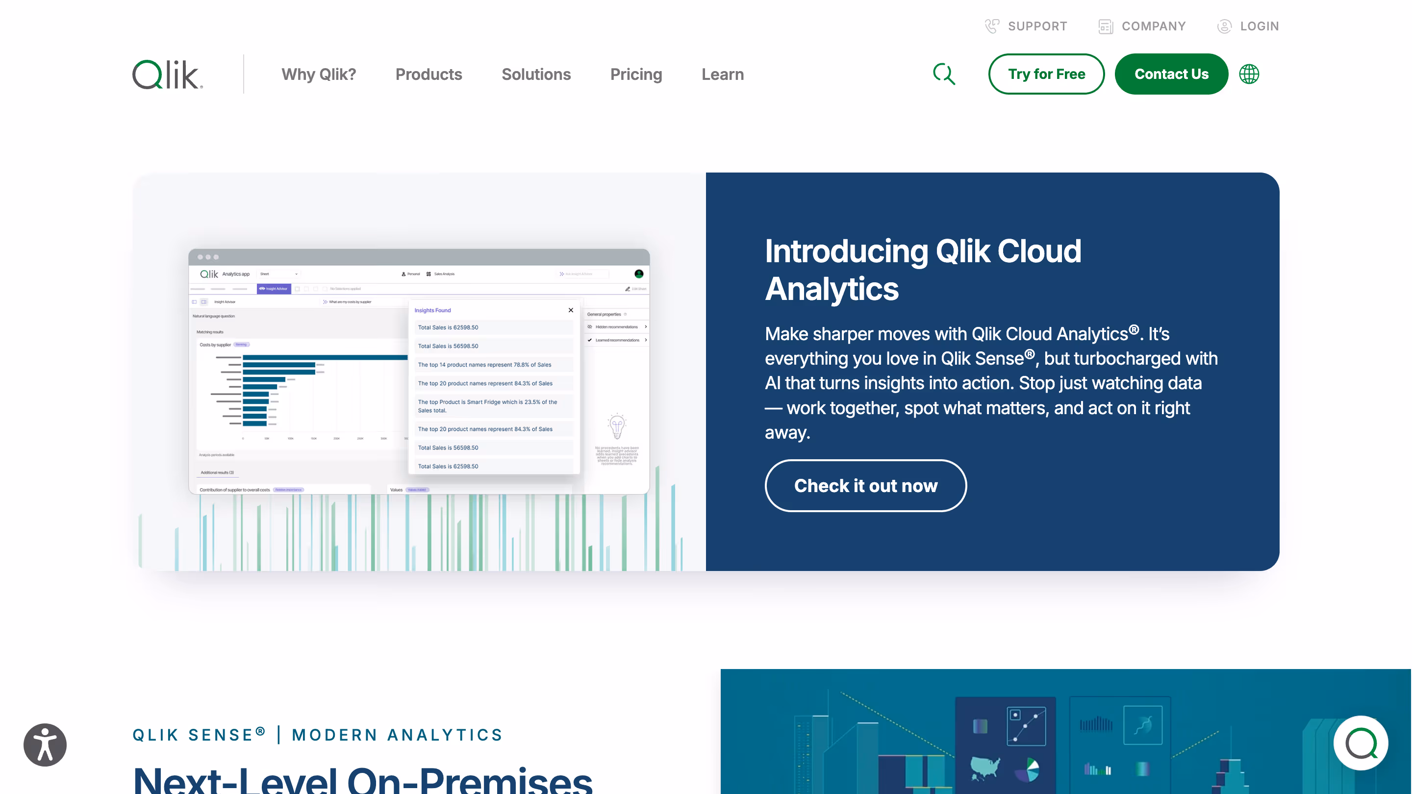
Qlik Sense is an enterprise BI platform built around a unique associative analytics engine. Unlike query-based tools that limit you to predefined drill paths, Qlik’s engine indexes all relationships in your data and highlights connections you might not have thought to look for.
Why Qlik Sense?
- Associative engine: Click on any data point and Qlik instantly shows what’s related and what’s not, across your entire data model and multiple data sources. This is genuinely different from how other BI tools work and can surface insights that get missed in traditional query-based exploration.
- End-to-end data pipeline: Qlik handles data integration, data preparation, and visualization from multiple sources in one platform, reducing the need for separate ETL tools.
- Hybrid deployment: Available as SaaS, on-premises, or hybrid — one of the few BI tools that still supports true on-prem deployment for organizations that need it.
What Users Are Saying
Reviews on G2 and Capterra show that power users love the associative engine and the depth of data exploration it enables. Qlik scores well on integration capabilities and self-service BI. The main complaints center around slow performance with large datasets, a learning curve for advanced features, and pricing that many users describe as expensive and unclear.
Pricing
Qlik Sense Business starts at $31/user/month. Enterprise SaaS offers Professional ($72.50/user/month) and Analyzer ($41.25/user/month) tiers. Enterprise on-premises pricing requires a custom quote. Volume discounts are available.
Qlik Sense Is Best For
Large enterprises with complex, multi-source data environments that value free-form data exploration over pre-built dashboards. Also a strong fit for organizations that need on-premises or hybrid deployment.
Watch Out For
Qlik’s in-memory architecture means data is loaded into RAM, which can be resource-intensive and expensive at scale. Embedded analytics implementations often require lengthy consulting engagements. The platform has a significant learning curve for non-technical users, and the UI feels dated compared to newer tools. If you’re looking for a quick-to-deploy, lightweight BI tool, Qlik is probably overkill.
6. ThoughtSpot — Best for AI-Powered Natural Language Analytics
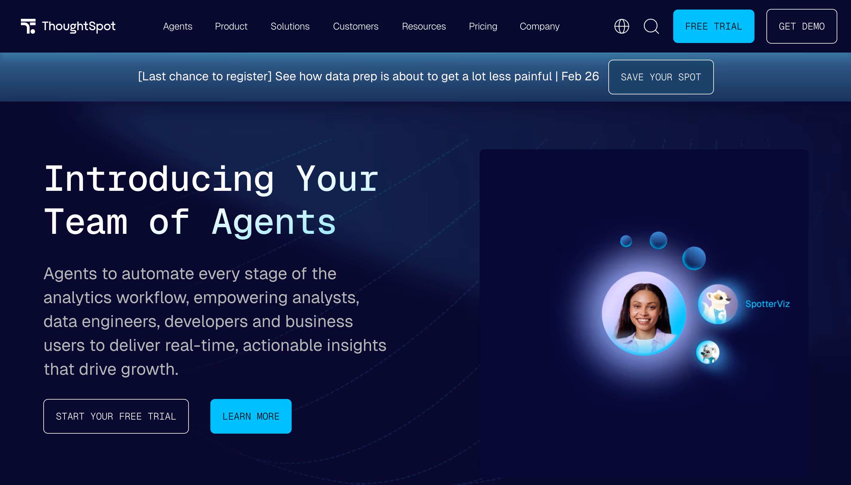
ThoughtSpot is a BI platform that leads with AI and natural-language search. Instead of building dashboards from scratch, users type natural language queries in plain English (like “What were our top-selling products last quarter?”) and get instant, visualized answers. It enables users to analyze data without any technical expertise — often described as “Google for your company’s data.”
Why ThoughtSpot?
- Natural language search: Users ask questions in plain English and ThoughtSpot translates them into queries against your data warehouse. This dramatically lowers the barrier to entry for non-technical users.
- SpotIQ AI analytics: Uses machine learning to automatically detect anomalies, trends, and patterns in your data, delivering automated insights and predictive analytics you might not have thought to look for.
- Warehouse connectivity: Connects to Snowflake, BigQuery, Redshift, Databricks, and more. Queries run against your warehouse in real time.
What Users Are Saying
Users praise the search experience for non-technical users and the speed of getting answers. One user reported that analysis requests dropped by 800% after deploying ThoughtSpot. However, reviews also consistently flag high and opaque pricing, limited visualization customization, and AI features that some describe as still maturing. Dashboard design flexibility is noticeably limited compared to traditional BI tools.
Pricing
Essentials starts at $25/user/month (up to 25M rows). Pro plan uses per-query pricing. Enterprise is custom. Average annual contract size is around $140,000 according to third-party data, with large-scale deployments exceeding $500K/year.
ThoughtSpot Is Best For
Organizations where the primary goal is empowering non-technical users to ask ad-hoc questions against existing data without relying on analysts or pre-built dashboards.
Watch Out For
Visualization customization is limited. If pixel-perfect dashboards matter to you, ThoughtSpot isn’t the right tool. Pricing can be unpredictable, especially with consumption-based models at scale. The platform is strongest as a search-and-explore layer but less suited for structured, production-grade reporting. Setting up data models for accurate AI responses requires engineering effort upfront.
7. Domo — Best for All-in-One Cloud BI
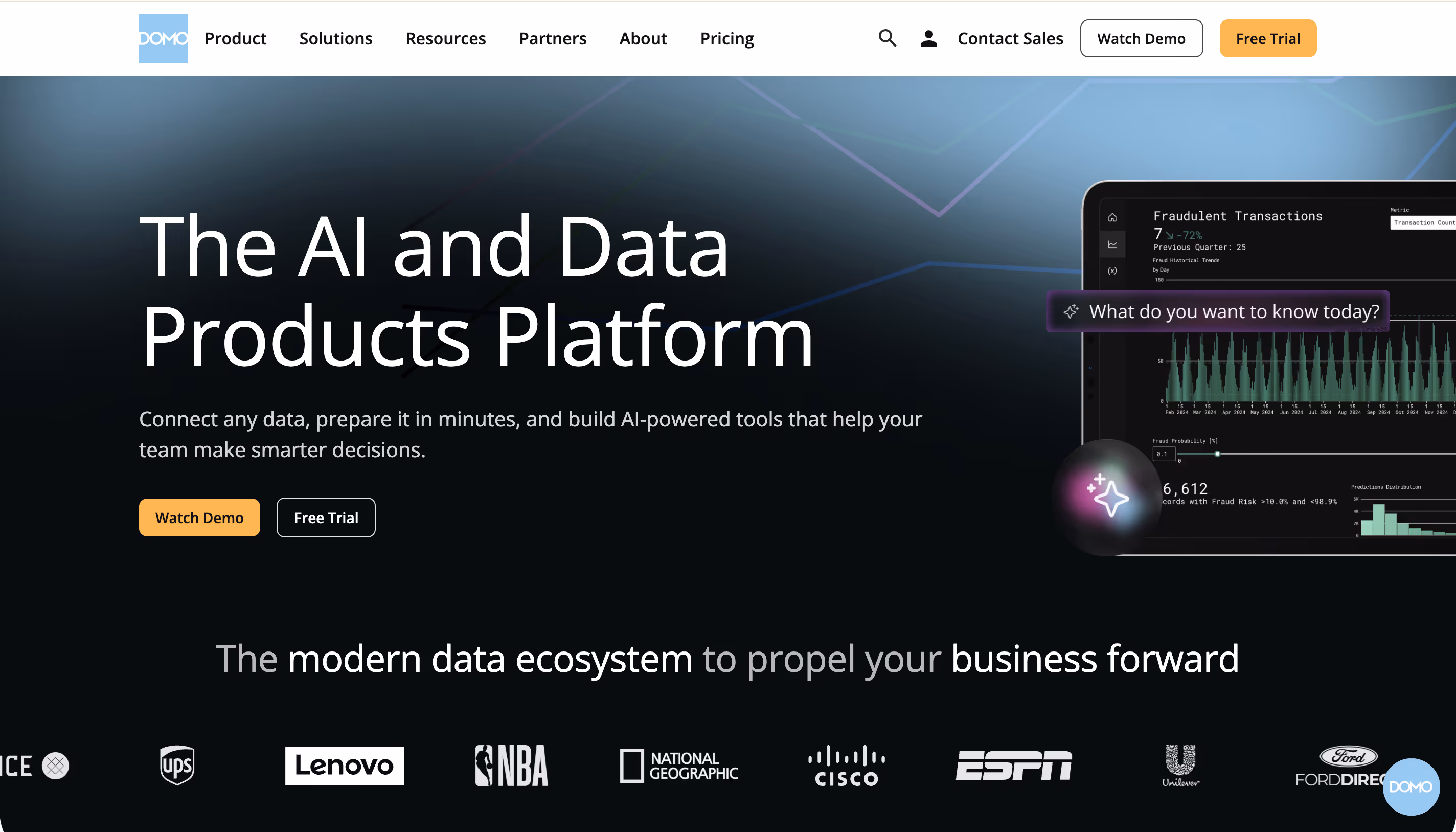
Domo is a cloud-based BI platform that bundles data integration, data management, visualization, and collaboration into a single product. It aims to be the one tool that handles everything from raw data ingestion to executive dashboards, without needing a separate data warehouse or ETL tool.
Why Domo?
- 1,000+ pre-built connectors: Domo connects to practically any data source out of the box — CRMs for CRM analytics, ad platforms, databases, spreadsheets, cloud storage. This is its biggest strength for teams that need to centralize data from many sources.
- Magic ETL: A no-code data transformation tool that lets non-technical users clean and combine data without writing SQL.
- Mobile-first design: Domo’s mobile app is frequently cited as one of the best in the BI space, giving executives access to dashboards on the go.
What Users Are Saying
Users praise Domo’s integration capabilities and the speed of connecting disparate data sources. The mobile experience gets high marks. However, cost is a dominant complaint. Domo’s credit-based consumption model makes it difficult to predict costs, and several users on G2 have reported dramatic price increases at renewal time. Customer support quality is another common concern, with some users describing it as hard to reach.
Pricing
Domo uses a consumption-based credit model and does not publish pricing. Based on user reports, small teams can expect $2,000–$4,000/month, mid-sized businesses $5,000–$10,000/month, and enterprise deployments $20,000+/month. A 30-day free trial is available.
Domo Is Best For
Organizations that want an all-in-one platform covering data integration, preparation, and visualization without managing separate tools. Particularly strong for marketing and operations teams that need to pull data from dozens of SaaS tools into one view.
Watch Out For
The credit-based pricing is the elephant in the room. Costs can spiral unpredictably as data usage grows, and renewal pricing has been a sore point for multiple users. The learning curve for advanced features is steeper than Domo’s marketing suggests. If you already have a well-managed data warehouse, Domo’s own data layer adds unnecessary duplication.
8. Metabase — Best for Budget-Conscious Teams
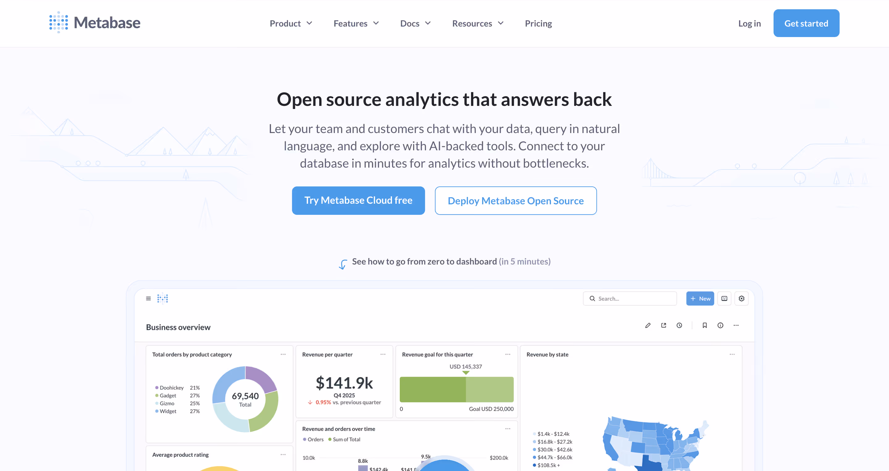
Metabase is an open-source BI tool that prioritizes simplicity. It connects directly to your database (PostgreSQL, MySQL, BigQuery, Snowflake, and many others) and lets anyone build dashboards and ask questions through a clean, intuitive interface — no SQL required for basic use, though a built-in SQL interface is available for data professionals who want it.
Why Metabase?
- Free open-source tier: Self-host Metabase for free with full core BI functionality. No artificial limits on dashboards, charts, or data sources.
- Visual query builder: Non-technical users can explore data and create visualizations without writing SQL. Power users can drop into raw SQL anytime for more complex analysis.
- Embedding options: Both static (view-only) and interactive embedding are available, making it a popular choice for startups that need to ship customer-facing analytics on a budget.
What Users Are Saying
Users consistently praise Metabase for its ease of use and value for money — it scores a 4.6 out of 5 for value on Software Advice. The open-source community is active and helpful. On the flip side, users note limited visualization options compared to premium tools, occasional performance issues with large datasets, and a ceiling that becomes apparent as analytics needs grow more complex. Support response times (3-day SLA on lower tiers) can be a bottleneck for teams that depend on BI daily.
Pricing
Open-source: free (self-hosted). Cloud Starter: $85/month (5 users included, $5/additional user). Pro: $500/month + $12/user. Enterprise: custom pricing, starting around $15K–$20K/year.
Metabase Is Best For
Small teams, startups, and developer-led organizations that want a simple, no-fuss BI tool without enterprise complexity or costs. Also a solid choice for engineering teams that are comfortable self-hosting.
Watch Out For
Metabase works well for straightforward dashboarding, but it hits a wall when you need advanced governance, sophisticated visualizations, or enterprise-grade security. The free open-source version requires your team to handle infrastructure, upgrades, and maintenance. If your needs will grow beyond simple reports, you may outgrow Metabase quickly.
9. Apache Superset — Best for SQL-First Open Source Teams
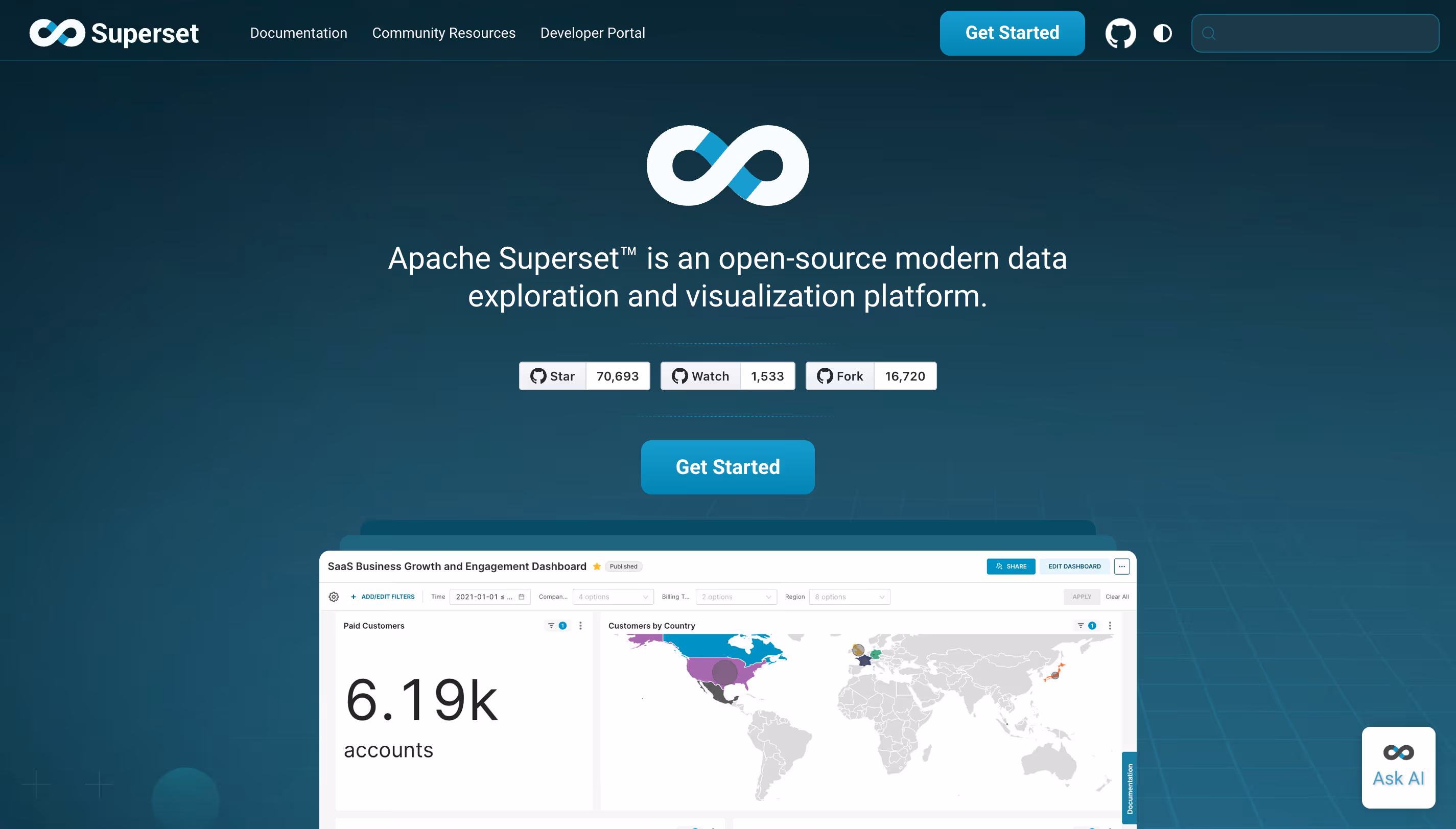
Apache Superset is a free, open-source data visualization platform originally created at Airbnb. It’s designed for data scientists, data engineers, and technical teams that are comfortable with SQL and want a self-hosted BI tool with a wide range of chart types and database connectors.
Why Superset?
- 100% free and open-source: No licensing costs, ever. Superset is maintained by the Apache Software Foundation and has a large, active community.
- 40+ visualization types: One of the most extensive chart libraries available in any open-source BI tool, from basic bar charts to advanced geographic visualizations.
- SQL Lab: A built-in SQL IDE that lets analysts write, test, and save queries directly within the platform. If your team thinks in SQL, Superset speaks your language.
What Users Are Saying
Superset gets strong marks for its chart variety and the fact that it’s truly free. Users appreciate the flexibility of a self-hosted, open-source tool. The downsides, however, are well documented: it requires significant technical skills to set up and maintain, the UI is functional but not polished, and there’s no commercial support unless you go through a managed provider. Non-technical users will struggle without SQL skills.
Pricing
Free. Apache Superset is 100% open-source and community-maintained. The cost is in engineering time for setup, configuration, and ongoing maintenance. Third-party managed hosting providers (like Preset, now part of Databricks) offer commercial support at additional cost.
Apache Superset Is Best For
Technical teams, data engineers, and organizations with SQL expertise that want maximum flexibility and zero licensing costs. A natural fit for startups with strong engineering teams but tight budgets.
Watch Out For
Superset is not for everyone. If your business users don’t know SQL, they’ll need significant help to get value from the platform. There’s no writeback and no production-grade reporting (scheduled PDFs, branded exports). Self-hosting means your team owns the infrastructure, upgrades, and security.
Key Takeaways
- If your data lives in a data warehouse, look at warehouse-native tools (Astrato, Sigma, Looker) that query your warehouse directly instead of duplicating data into a separate BI layer.
- If you’re in the Microsoft ecosystem, Power BI is the obvious starting point — but be aware of the learning curve (DAX), the import-mode limitations, and the true total cost of ownership beyond the $14/user sticker price.
- If you need embedded, customer-facing analytics, Astrato offers white-label embedding, multi-tenant row-level security, and usage-based pricing that won’t penalize you for scaling to thousands of end users.
- If budget is the primary concern, Metabase and Apache Superset offer real BI capability at little or no licensing cost, just factor in the engineering time for setup and maintenance.
- If AI-powered analytics is your top priority, ThoughtSpot and Astrato both invest heavily here, but through different approaches: ThoughtSpot leads with search, while Astrato connects AI directly to a semantic layer for more context-aware results.
Ready to See What Warehouse-Native BI Looks Like?
Choosing a Tableau alternative isn’t just about picking the cheapest option or the one with the longest feature list. It’s about finding the right BI tool that fits how your team actually works today and where your data architecture is heading tomorrow.
If you’ve moved your data to a modern cloud warehouse and want a BI layer that actually takes advantage of it — live data, no extracts, no-code self-service, and the ability to embed analytics into your products — Astrato is worth a look.
Book a demo with the Astrato team and see how warehouse-native BI works with your actual data. No slides. No hypotheticals. Just your data, live, in about 30 minutes.
Ready to experience next-gen analytics?
See how Astrato runs natively in your warehouse.