
Snowflake Summit Parties
An interactive Astrato map of the top parties at Snowflake Summit, curated by Snowflake Data Superhero Piers Batchelor.
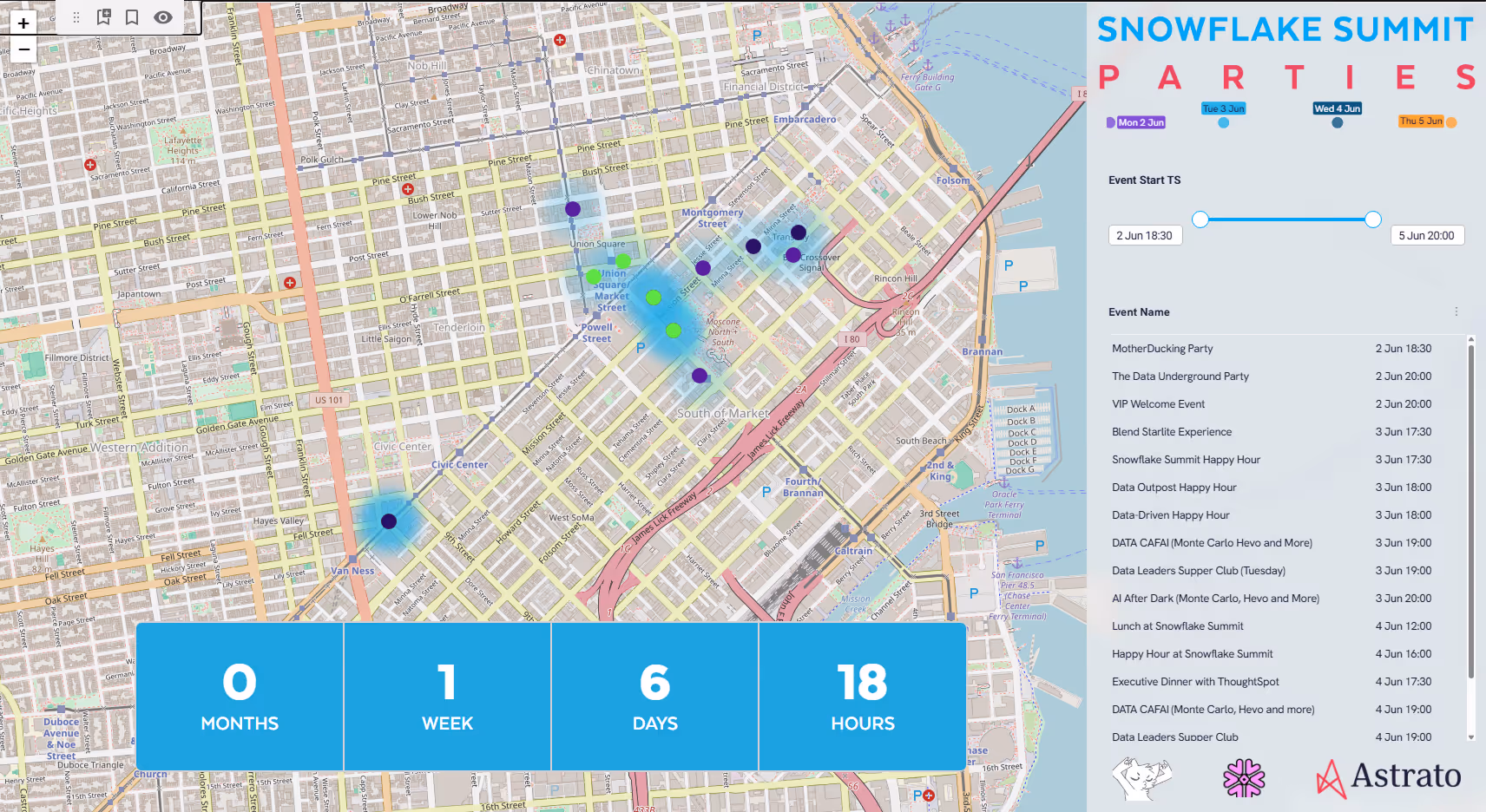
Chart Configurator
Configure chart type, dimensions, legends, labels, colors, and Top N filters live in Astrato — see how much control you get over visualizations.

❄️🦸2026 Snowflake Data Superhero Map
An interactive Astrato map of the global Snowflake Data Superhero community, built with Cortex-enriched location data and native heatmap layers.


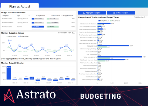
Price Modeling & Churn Risk Management Data App
No-code churn risk modeling in Astrato — adjust customer MRR and instantly model churn risk, powered by Snowflake and Snowpark integration.

Advanced Calculations
See how Astrato's self-service formulas let users build running totals, period comparisons, and inline % changes — no SQL or data team needed.
Gallery - Bar and Column Chart
Use grouped and stacked bar and column charts in Astrato for trend comparisons, category breakdowns, and before/after analysis — drag-and-drop.

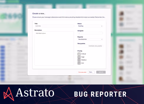
Bug Reporter
Track, triage, and resolve bugs in real time. Filter by status, priority, and assignee with inline forms and live insights for product and QA teams.