
Cloud Data Viz and Analytics Health Check
Uncover the fitness of your Cloud Data Viz & Analytics
Get my free scoreBuilding a Data Dashboard with Astrato: Best Practices
At Astrato, we talk a lot about insights and dashboards and making the most of your data, but how do you actually do that? In this blog, we’ve put together some best practices for first-time ‘ASTRATOnauts’ who are looking to perfect their first workbook (you might call it a ‘dashboard’!) with Astrato, or veterans in need of a refresh.
This blog is a sequel to Building a data dashboard with Astrato: Getting started – give that one a read first if you aren’t sure how to create a workbook, connect your data source, or customize your data.
First, return to your big-picture plan
If this is your first ever Astrato workbook, you might want to give yourself some time to enjoy Astrato’s intuitive layout and experiment freely with objects and charts. However, it’s still a good idea to have a plan in mind. Our prequel blog covers this in more detail, but here are some of the questions you should reflect on before you begin:
- Who will be using this dashboard?
- What problem am I trying to solve?
- What decisions do I need to make and what insights might help make them?
With these questions answered, and an idea of what types of visualizations you might want to use, you’re now ready to start creating! We like to break things down into three parts – colors and graphs, text and accessibility, and overall design.
Choose a color scheme and start refining your graphs
It is a good idea to decide on a color scheme before you start adding graphs. There are three key points you need to remember:
- Choose an intentional color scheme. Colors should represent the data theme or brand colors. Existing color associations are also a powerful tool (e.g., green = good, red = bad)
- Use color to highlight important data. Colors should take the viewer’s eye to key aspects of the data, promoting insights. Muted colors can then be used for less important, supporting, or comparison data
- Ensure your use of color is accessible: Ensure that the colors are legible for people with colorblindness or when printed in grayscale. Use technology to help you view the work through a colorblind or grayscale lens
Whatever type of graph you use, you should be able to answer the question “why this graph?” First and foremost a graph should be useful – it should convey the necessary information in the most efficient manner to provide insight. No graphs should be for appearance only, and you should try to avoid duplicating information.
“There will be a lot of insights that could be visualized in any dataset, but using them all, or using too many is overwhelming. Choosing the most interesting and actionable insights, keeping the information concise, and eliminating the noise is the best way to get Business Users to utilize the dashboard” – Stephanie French, Data Visualization Developer at Astrato
Adding your data: Four things you should always do
The next step – actually adding your data – can feel overwhelming. Your data is unique and brings with it a specific set of challenges, but there are some things you should always do:
- Data should be displayed in an order that makes logical sense to the viewer. For example, by frequency counts (from greatest to least for categories), by time period (line charts), or by intrinsic order (e.g., agree, neutral, disagree).
- Use no more than the precision that you need. Round and abbreviate when necessary. E.g., 7k instead of 7,000 or 3.2 instead of 3.200.
- Choose metrics and KPIs carefully to find insights. Include comparison numbers to provide viewers with benchmarks.
- Ensure axes have accurate proportions and equidistant interval ticks. This usually means starting at zero on each axis. A secondary axis should only be used if absolutely necessary.
With your graphs in place, you can now start refining your text.
Add text and check your data dashboard for accessibility
The golden rule for text on dashboards is always less is more. Reducing the amount of text on your dashboard – and using straightforward terminology – makes it much easier for your audience to digest the information that is being conveyed. Writing concisely also makes you consider the words you choose and the conclusions you draw.
Titles should also follow this principle. Your workbook title should quickly summarize the dashboard topic and takeaway, while graph titles, subtitles and annotations prompt the viewer by asking a question or adding explanation or interpretation.
Getting inside the minds of your viewers can also be beneficial in other ways:
“Most people are going to read the dashboard left to right and top to bottom, so focus the top left corner on the things you need them to engage with the most. For example, the Seattle Housing Market dashboard (found below) has the input form in the top left so that’s it’s the first thing users do when opening the dashboard” – Elizabeth Tofany, Data Visualization Developer at Astrato
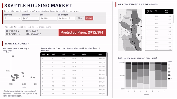
You can take a closer look at this interactive dashboard, here.
Five tips for dashboard accessibility
Accessibility should be considered every step of the way when building your data dashboard. We have already touched on accessibility when it comes to use of color, but there are many elements that make up accessibility when it comes to text. You can find a comprehensive guide to accessible and inclusive dashboards in this blog by Vizlib, but for now, here are some things to keep in mind:
- Bold and/or large titles (to differentiate them from body text)
- Fonts should be easily readable (minimum 12pt for serif fonts and 10pt for sans serif fonts)
- Ensure enough contrast between text and background
- Keep text horizontal
- No excessive formatting (italicized and underlined words require more cognitive effort to read and process)
Your dashboard is almost there! Now it’s time for some finishing touches.
Finally, step back and return to your dashboard with fresh eyes
Zoom out and consider your work as a whole. If possible, take a break and come back to the dashboard with fresh eyes. Ensure that the key insights that answer your main question are highlighted, that the viewer will move through the dashboard with ease, and fine tune any details. Questions to ask yourself at this stage are:
- Does every image, icon, and graph serve a purpose?
- Are all of the fonts, sizes, labels, colors (etc.) consistent?
- Are all objects aligned properly to help the viewer’s eye travel through information in order of use and importance?
- Is whitespace being used effectively to highlight key objects or give viewers eyes a break?
- Have you remembered to include tooltips to add supplementary information without crowding the dashboard?
Building dashboards can be complex and challenging, but following this guidance is a sure fire way to ensure that yours are not just dazzling, but effective and meaningful. Finally, check out our dedicated Astrato Workbook Performance Checklist for more information.
Get inspired and start creating impactful visualizations, today!
You’re now ready to start spotting analytics trends, reporting insights, making informed decisions, and actioning change in your projects. Click here to get started with Astrato, or read about our latest product updates, in our February roadmap update blog.
Looking for some dashboard and visualization inspiration? Have a browse of our gallery of eye-catching workbooks – including workbooks on Elon Musk, the Tour de France, and COVID-19 gender equality – or visit our community forum, Astrato Galaxy, to connect with other ASTRATOnauts!
